"It feels like the whole day is on hold."

Fixie AI
Timeline
Dec 2025 - Feb 2026
TEAM
Individual
MY ROLE
UX Strategy
UI & Interaction
AI Workflow
Rapid Prototyping
User Research
In most repair flows, you report the problem and then you’re left guessing. No update, no timeline. Fixie AI works in the gap between the report and the fix, where a stalled repair costs a home a day, and a restaurant its business.

GYUHO Lee © 2026
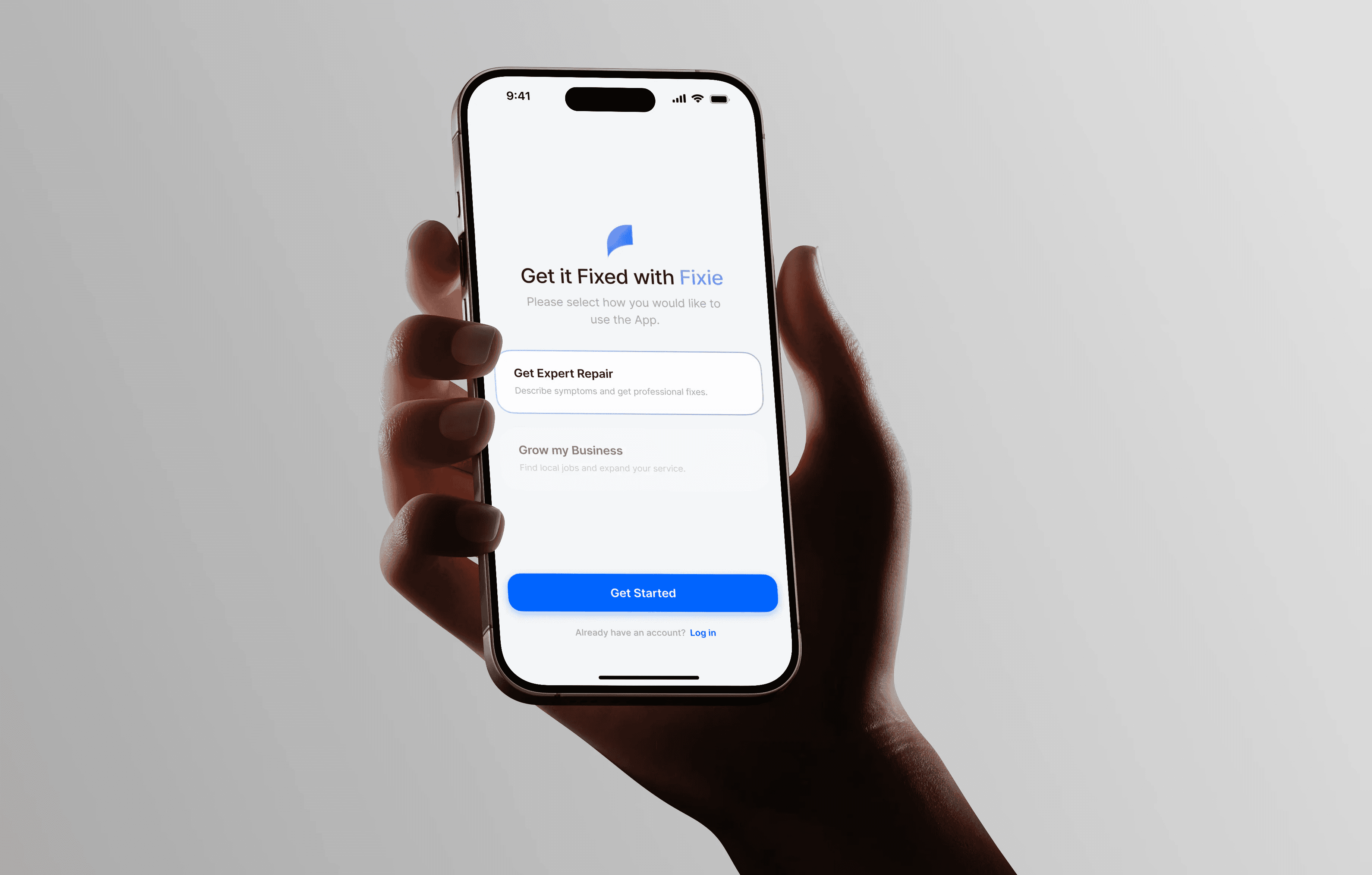

Get close


A fast fix isn't the point. A visible process is.
01. Highlights
No guessing.
No waiting.
Just what's next.
AI Diagnosis
Vague symptoms, clear data
Before, a broken machine meant guessing, then waiting for a callback. Fixie AI reads the symptoms you can describe and turns them into a diagnosis a technician can act on.
Dynamic Matching
Watch the repair unfold
Each step shows up as it happens, so no one has to call and ask “where are we now?”
Fast Response
Urgent jobs, surfaced first
Technicians see urgent jobs first, send a first estimate from the details Fixie AI gathered, and head out once the customer approves the estimate.
In prototype testing, the matched flow brought the first estimate from 11–14 days to under 30 minutes.
02. Process
Human judgment. AI speed.
Challenge
AI fills the gaps with averages
AI is fast, but it reaches for the average answer. In a repair flow shaped by anxious users and field constraints, the average answer quietly erases the details that matter. Speed without judgment just produces confident, generic output faster.
Solution
Decide where to let go, and where not to
I mapped the points where a wrong default would cost the most, and kept human judgment there. AI runs the rest. The skill wasn’t using AI or avoiding it, but knowing exactly when to step in.
Macro Framework
The principle, in three moves:
Phase 1.
Brain (Human)
Role - Empathy, Definition
Output - Problem Statement
Phase 2.
Spark (AI)
Role - Ideation, Variations
Output - Raw Layouts
Phase 3.
Hand (Human)
Role - Logic Check, Edge Cases
Output - Final Polish
4 Step AI–Human Collaboration
Below, the same principle applied step by step in this project. Every screen was tuned around three signals: clarity, urgency, and trust.
Step 1.
Research & Synthesis
AI clustered scattered complaints into candidate pain points; I re-checked every cluster against the raw interviews by hand, so each traced to a real account, not a keyword match. (14 interviewed, 7 in depth.)
Step 2.
Information Architecture
I set what an anxious user needs first; AI stress-tested the flow for edge cases I’d missed.
Step 3.
Rapid Visual Exploration
AI drafted low-fi layouts in minutes; I reframed what it couldn’t see: the field constraints and the emotional context.
Step 4.
Prototyping & Refinement
I built the technician screen around urgency (time-limit bar + fast-accept bonus); AI checked interaction timing and flagged states I’d overlooked.
03. Problem Space
Pending. No ETA.
Working at a restaurant in Berlin, I watched a minor repair stall for days because no one could say what came next. Fixie AI works on both sides of that gap: the person who needs the fix, and the technician who takes it on.
UX Breakdown
Key Friction Points
Where it broke down
Core Insight
Key Friction Points
Communication gaps
After reporting an issue, people had no idea what came next, how long it would take, or whether anyone understood the problem.
“I wasn’t sure what was happening, but I had to pretend I understood.”
No one could say when
No reliable signal of when a technician would arrive, or when the problem would actually be solved.
“I keep checking my phone. It feels like the whole day is on hold.”
Silence after the first report
Once the report was in, progress disappeared from view, leaving people to chase updates themselves.
“If one small part is missing, I lose another day of business.”
Key Friction Points
The black box
You might know how repairs work in theory.
You still can’t see where yours actually is.

Quick Insight
Technicians were willing.
The blockers were manual work and missing data.
3 technicians · 4 shop owners · Berlin
The Anatomy of Friction
The frustration was real. Its cause was structural. Mapping the journey surfaced two points where the system went silent.

…
A few repeat visits cost a full day of downtime. All of them cost the owner time or money

The questions
left unanswered
“When are they actually coming?”
“Will it be fixed properly?”
“Do I need to keep following up?”
Representative quotes from customer interviews.
The Core Insight
From 'Fragmented Steps' to a 'Synchronized Loop'
When people reach for AI or call around for answers, it’s rarely impatience. It’s uncertainty. The real problem was never the speed of the repair, it was the silence around it.
Strategic Definition
So the solution stopped being a matching system. It became a communication layer that removes the black box between diagnosis and repair.
Design Principle
‘Zero Guesswork’
People should never have to guess what’s happening. I cut visual noise and pushed the key information (status, time, steps) to the front. The point wasn’t smarter AI. It was clearer information that lets people act with confidence.
Integrated Strategy Map
Where friction meets the fix
Each user-facing friction, traced to its business root and matched to a design response.
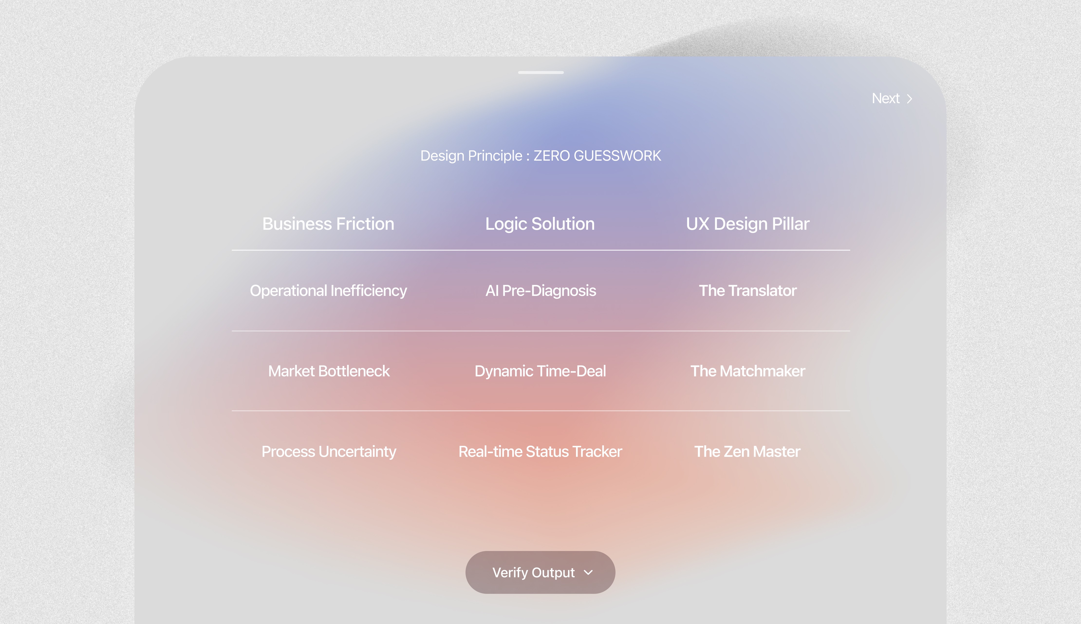
Challenge
to Strategy
1.
Operational Inefficiency
Targeting a “Zero-Guesswork” Experience
Challenge: Information Asymmetry
Technicians often arrive without enough information about the issue.
Strategy: AI Pre-Diagnosis
Converts user descriptions into clear, structured data so technicians are prepared before arrival.
Goal: Less downtime per job
A first visit that actually fixes it spares the owner a lost day of business.
2.
Market Bottleneck
Improving Match Speed Through Incentives
Challenge: Supply-Demand Imbalance
Matching delays during peak hours or for urgent tasks, leading to lost opportunities.
Strategy: Dynamic Time-Deal
Highlights high-value jobs in real time to encourage faster responses.
Goal: Demand captured at peak
Urgent jobs get filled instead of slipping away as lost work.
3.
Process Uncertainty
Building Trust by Minimizing “Anxiety Costs”
Challenge: High Anxiety Costs
Users feel stressed due to a lack of visibility during the repair process.
Strategy: Real-time Status Tracker
Provides a clear, trackable timeline that shows progress and builds confidence.
Goal: Repeat business, not chasing
A visible process earns the next booking and referral, and spares the constant status check-ins.
04. Strategy
Three pillars. One goal
: end the uncertainty.
AI doesn’t replace technicians; it replaces uncertainty.
Why AI?
People already lean on AI to make sense of everyday problems. So I placed it exactly where the anxiety peaks, in the gap between diagnosis and action. It doesn’t do the expert’s job. It structures the messy, incomplete signals on both sides, so the user and the technician finally work from the same picture.
Step 1.
The Problem (Uncertainty)
User: anxious, guessing at what’s actually wrong
Technician: heading out half-blind, no real data about the site.
Step 2.
AI Intervention (Structuring Signals)
AI turns scattered input into a structured brief, syncs the timeline, and gives the technician a real picture before arrival.
Step 3.
Human Action (Confident Execution)
User: calm, because the process is finally visible.
Technician: arriving prepared, with the right parts and tools.
3 UX Design Pillars
Three design pillars, one for each friction the product had to solve.
01.
The Translator
AI Data Structuring
Turns a user’s rough description into a structured brief the technician can read at a glance.
The technician sees the likely issue before leaving, so fewer trips end in “I’ll have to come back.”
Prepared visits
02.
The Matchmaker
Dynamic Incentives
Raises the reward on urgent jobs in real time, so the ones that matter get picked up first.
During peak hours, urgent tasks surface first instead of sitting in a queue.
No job left waiting
03.
The Zen Master
Timeline Clarity
A live timeline that shows exactly where the repair stands, no need to ask.
When people can see the whole process, they come back, and they recommend it.
Trust that earns the next call
05. Exploration
AI explores. I decide.
Design Goal
To move fast on early exploration with Google Stitch, so my own time went to the structural calls AI couldn’t make.
AI Exploration,
Human Judgment
Google Stitch generated a wide range of IA layouts in minutes. I kept the structure that read most intuitively, reset the visual priorities around how the service actually works, and reworked the drafts so the data held up in real use, not just on screen.
The Translator
One structure, both sides
Problem
The Translator turns a user’s plain-language description into a structured diagnostic brief, the part you’ve already seen. The same structuring had to work on the technician’s side too, where the call was how to organize those briefs at scale.
AI Assistant
Fixie
Analyze and diagnose the issue with specialized technical AI
Connect users with professional technicians when needed

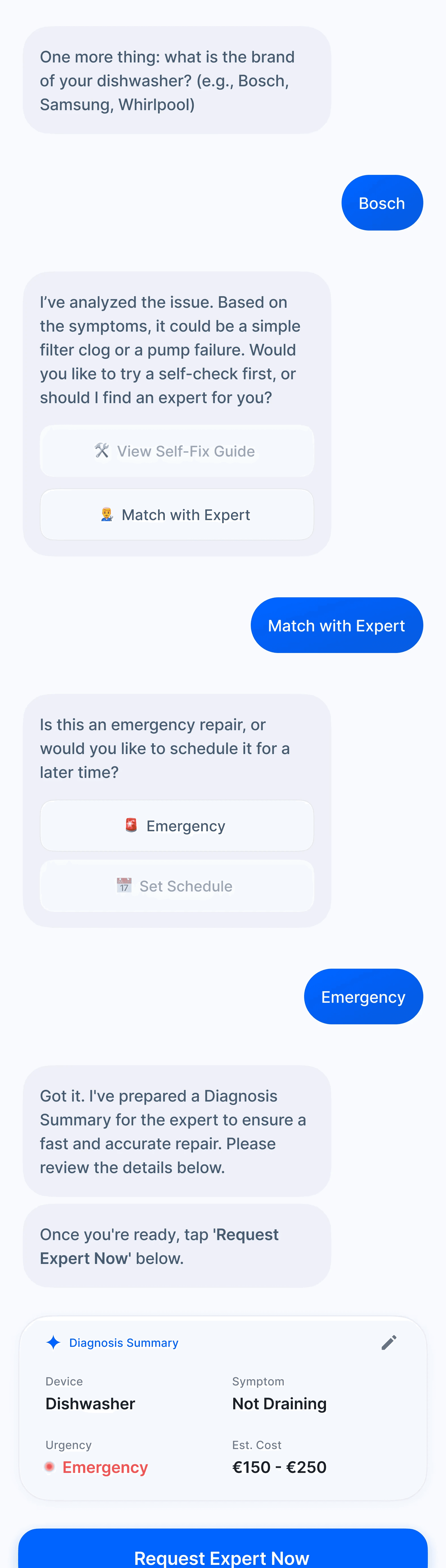
Before matching users with a technician, the system proposes self-repair options.
This prioritizes user autonomy and potential cost savings.
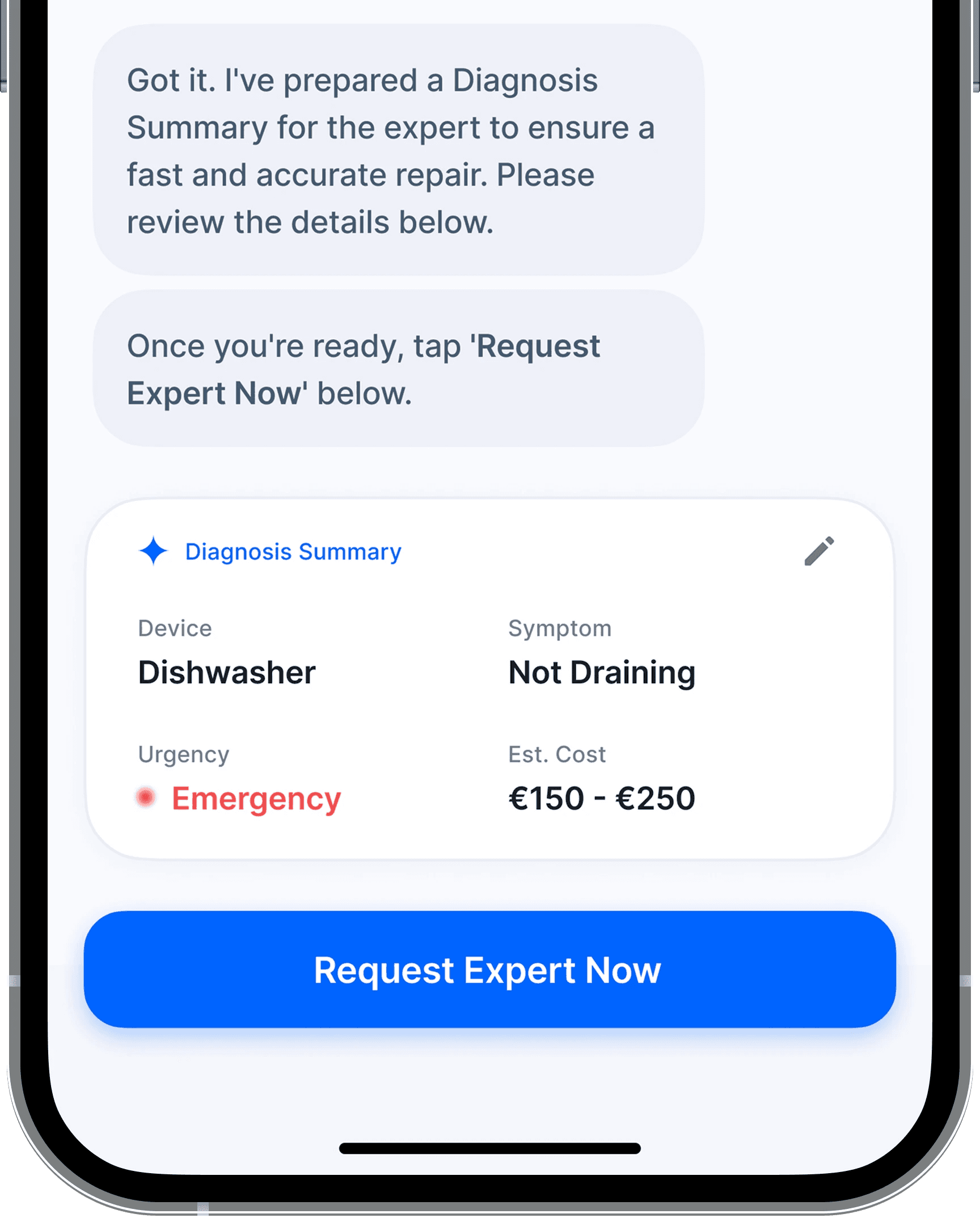
How does the technician see this?
The diagnostic brief gives the technician the error codes and likely parts up front, so the first visit is the one that fixes it.
Why job codes, not names
The AI draft sorted jobs by customer name. That breaks the moment a technician juggles ten jobs at once.
A consumer app can lead with names or locations. A technician’s tool needs a system that scales, indexing that holds up across dozens of active jobs.
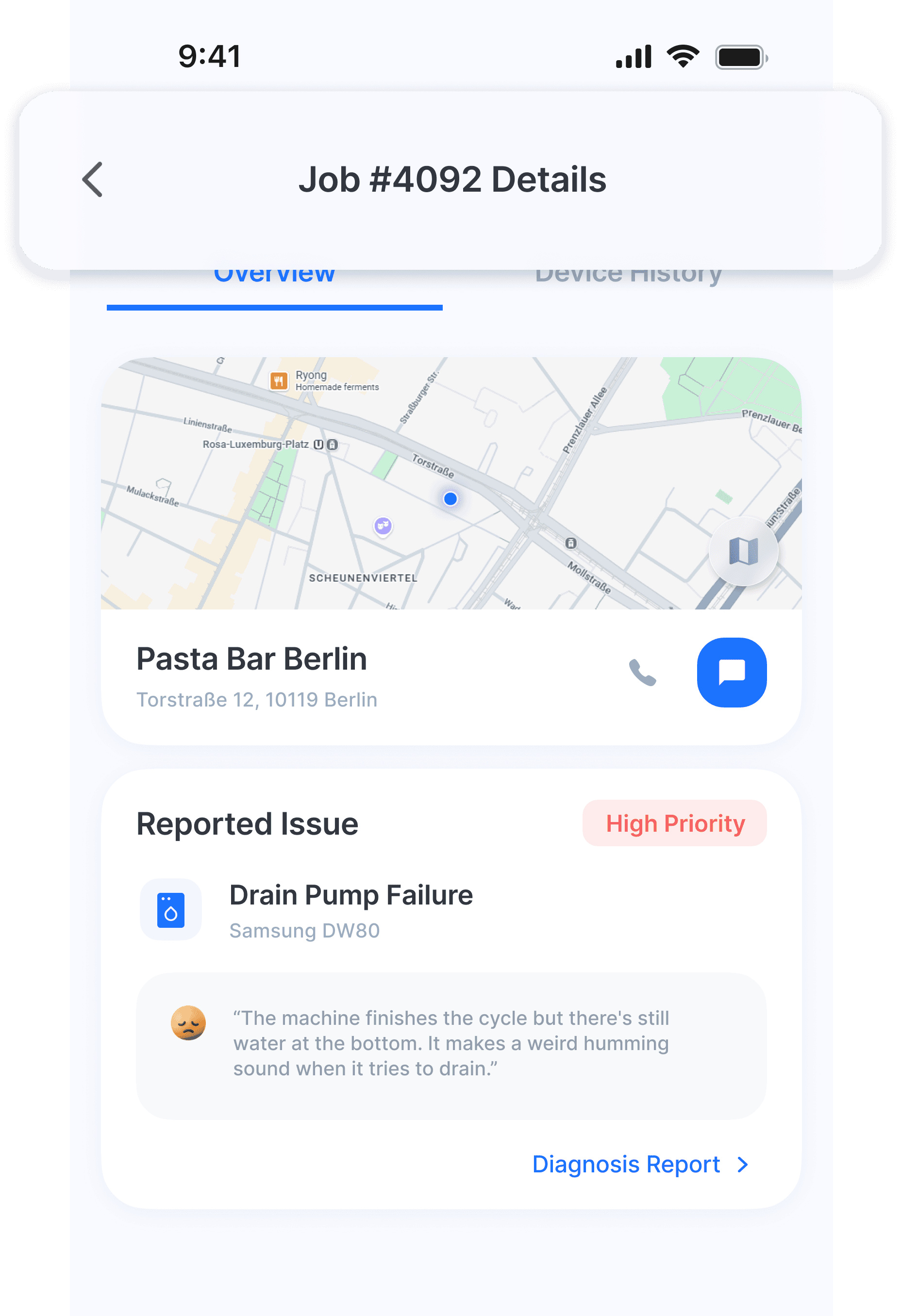
So I switched to unique job codes (Job #4092), so a technician can find and track any case in seconds.
The Matchmaker
Matching that works
in the field
Independent technicians often rely on manual workflows and unstable customer acquisition.
To address this, I introduced a ride-hailing-inspired model, integrating automated matching and structured workflows directly into the dashboard.
Technicians open it on the move or mid-job, so it isn’t built for browsing. Accept the job, check the details, send a proposal: one straight path, where the next step is always the obvious one.
Two modes, Standard and Urgent, structure workflow around Urgency.
Decision order: Urgency → Value → Fit
Urgency Drives Earnings
Choosing “ASAP” raises the technician’s payout, so urgent jobs get picked up first instead of sitting idle.
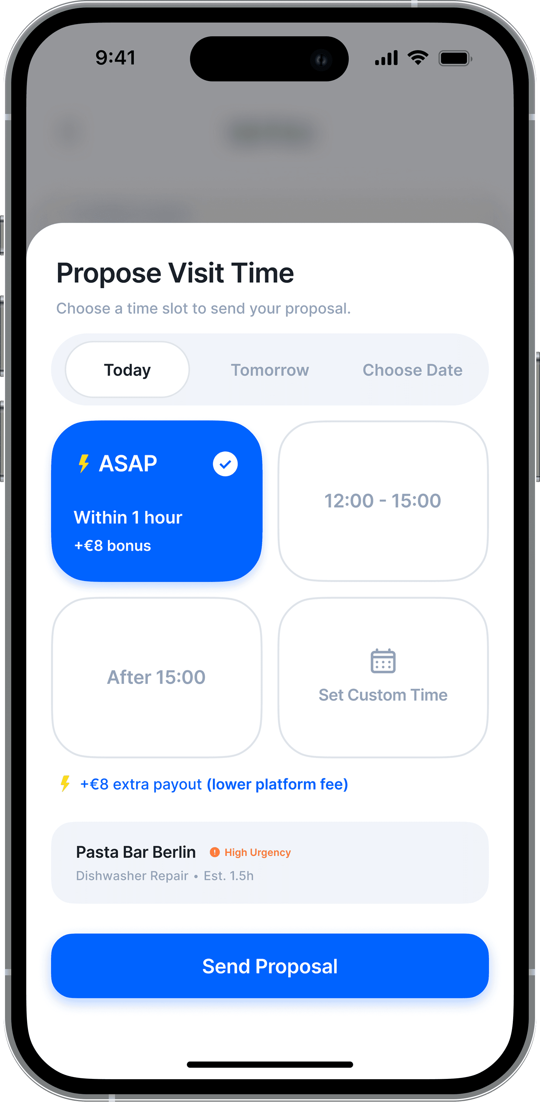
The reward is visible before the technician accepts, a lower platform fee on urgent jobs, so the incentive is obvious, not buried.
Technicians - see the higher payout up front.
Customers - get matched faster.
Deep Dive: Resolving UX Conflicts
While prototyping the task management tab, the AI-generated UI surfaced interaction conflicts that static mockups had hidden.
Interaction Conflicts
Map vs. Card Gestures
Overlapping scroll areas made one-handed interactions unreliable.
Reduced Map Visibility
Large cards reduced map visibility, making routes harder to scan.
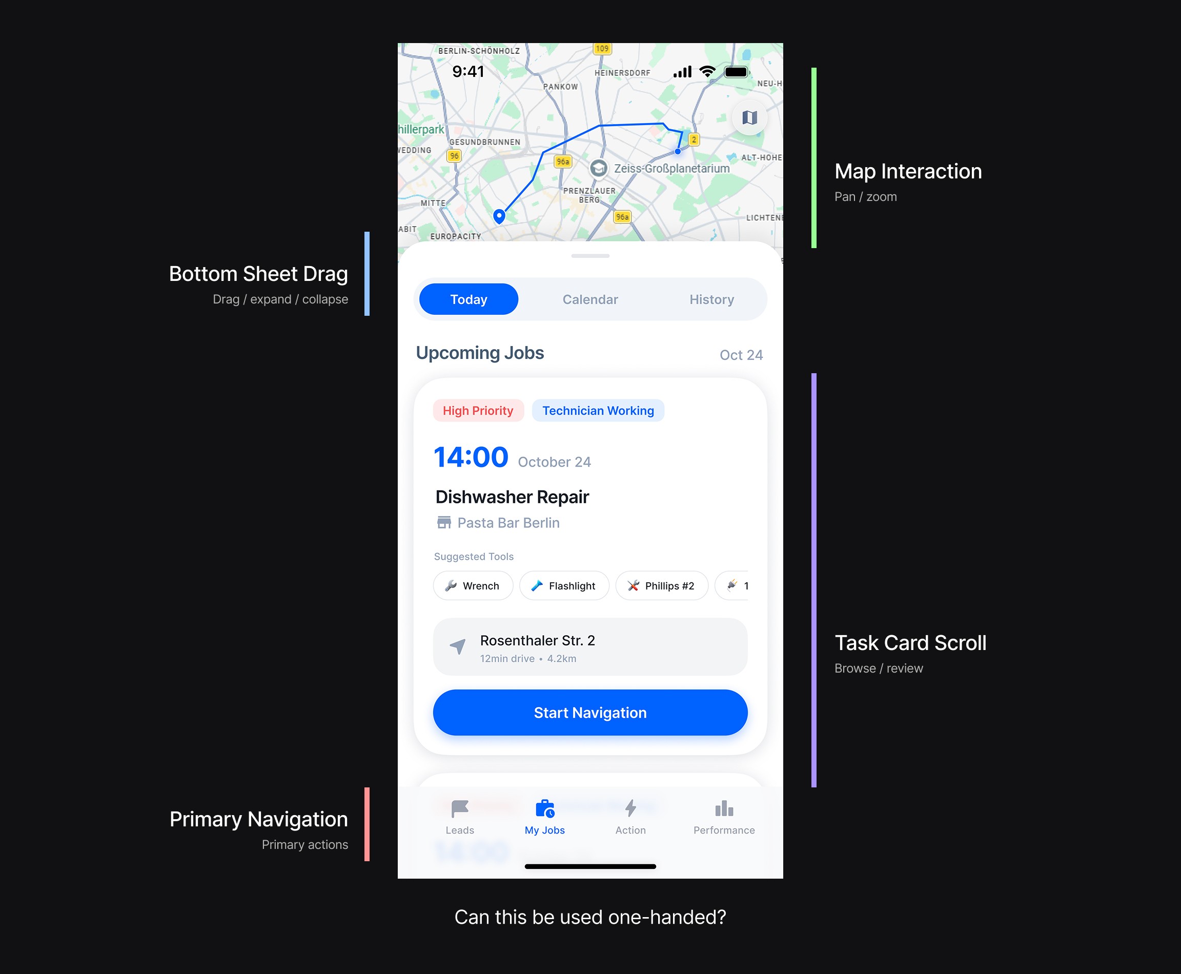
The interface needed to adapt to real field behavior, not just visual layout.
View AI Draft → Final UI
Separated Interaction Zones
Horizontal scrolling separated task browsing from map interaction, reducing gesture conflicts.
Adaptive Viewport
Once navigation starts, the task card minimizes to keep the route visible while remaining easy to revisit.
The Zen Master
Operational Transparency
A shared timeline put every step in view, updated as the repair moves.
Shared Visibility
The user’s progress view and the technician’s actions update from the same source, so neither side is guessing.
Reduced Workflow
The AI draft listed the technician’s updates like a shopping app. With gloves on and one hand busy, that meant aiming at thin rows, so they became four large tiles, quick to tap mid-repair.
PING System
The restaurant owner flagged a recurring complaint: customers couldn’t get an update without calling, again and again.
“Can technician status be checked in just a few taps?”
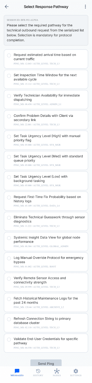
Side Effects:
More options ➔ More hesitation ➔ More confusion
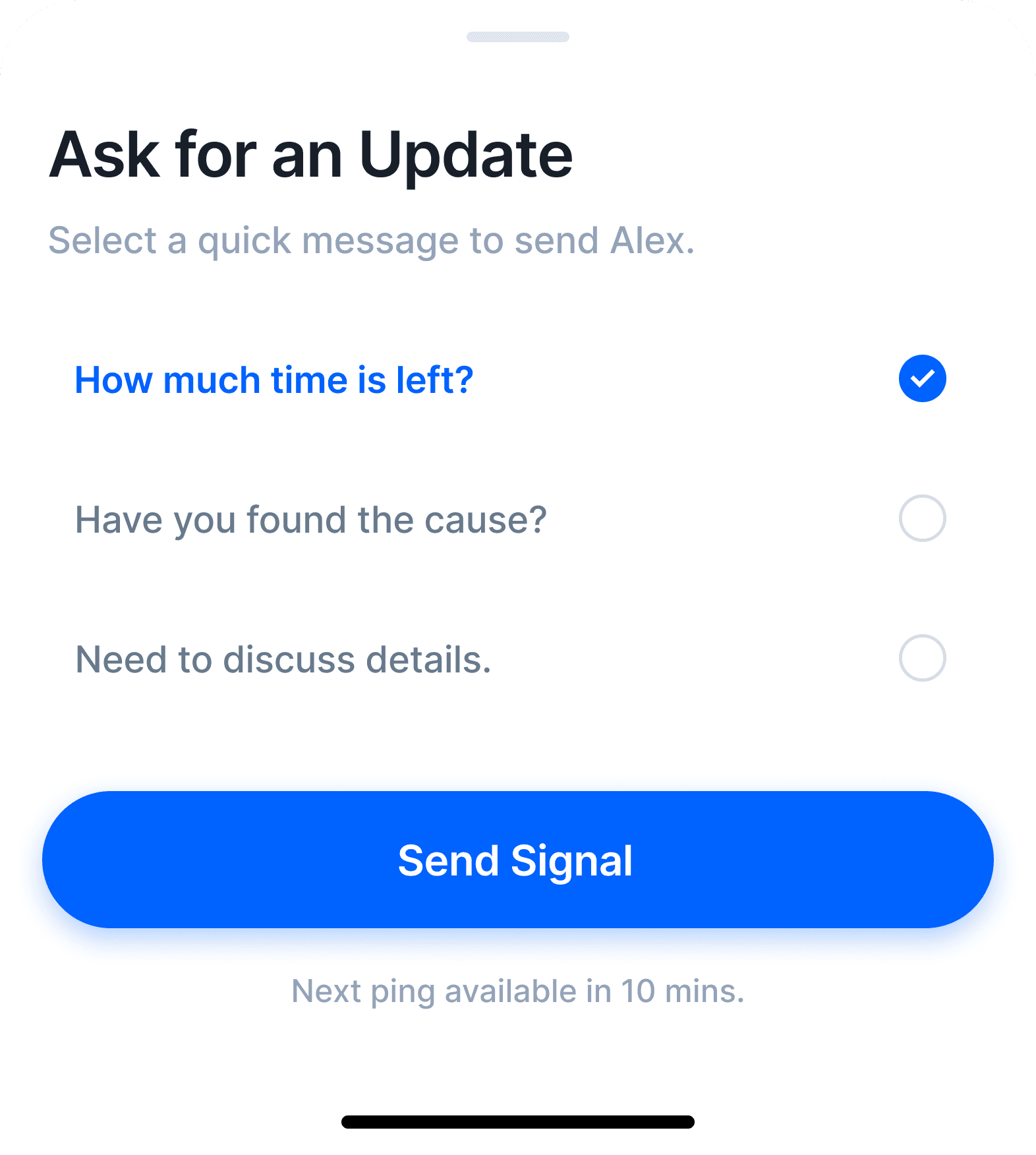
So I cut it down with the restaurant owner, to the three questions customers actually asked. Send, and wait, no calling.
Response Windows & Accountability
The 10-minute window isn’t a deadline, it’s an offer. Respond in time and the +€8 urgency bonus is yours. Let it pass and the request stays active, just without the extra.
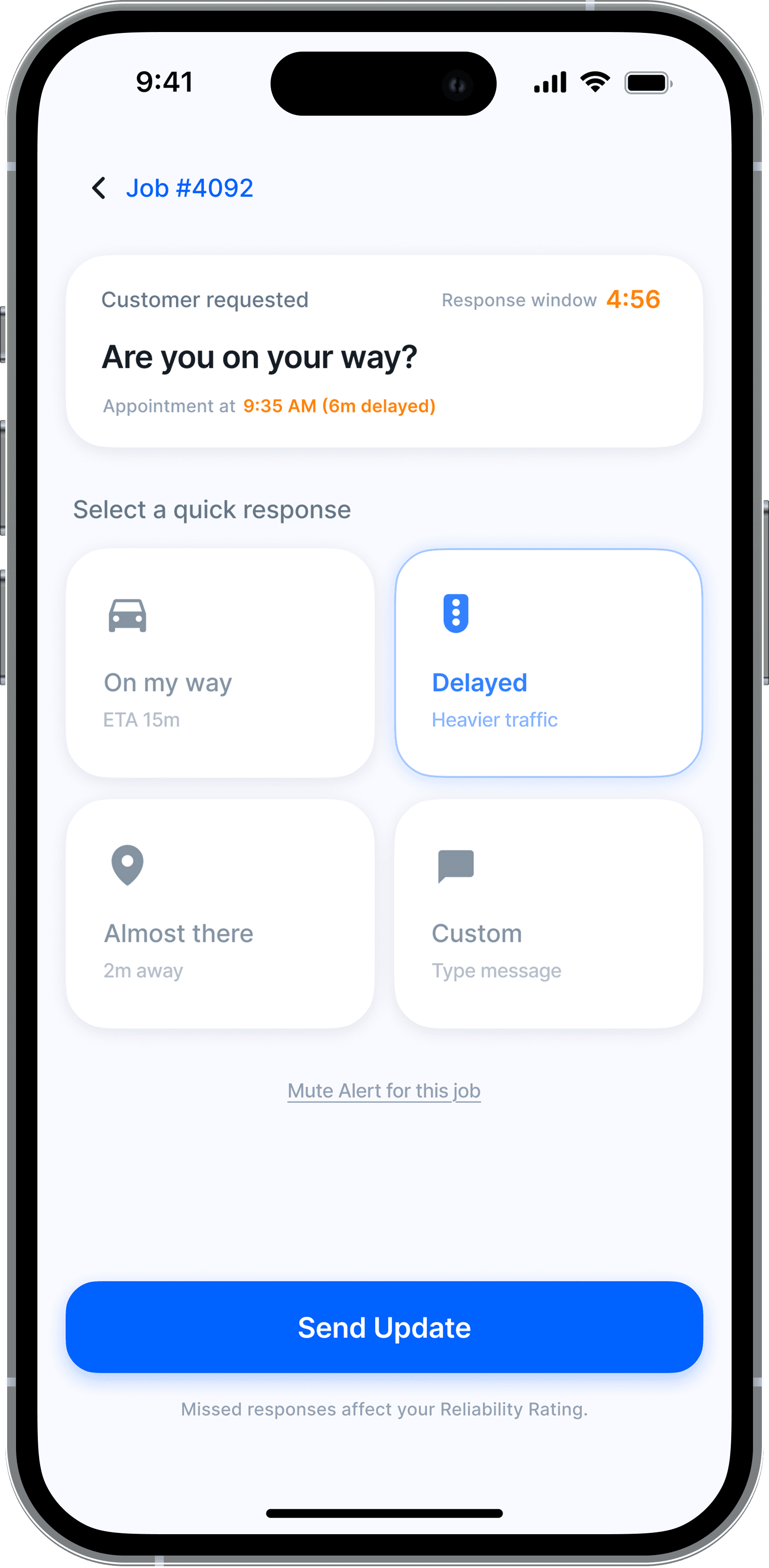

Repeated misses lower the technician’s reliability score, so fewer jobs surface next time.
Motion as a signal
Two moments use motion on purpose.
I tested both versions with potential users. Faster, brighter motion mostly read as an alert or error, while the slower interaction was the one people called calming.
Slow pulse: the active step breathes, signaling calm.
It’s moving, you don’t need to do anything.
Live countdown: the response bar shrinks, making urgency physical. Now matters.
“The pulsing motion settled the tension.”
— Minjun, works at an Asian restaurant
The interface speaks before the text does.
Digital Handshake
To close the loop with trust, not a surprise bill, the system adds one confirmation step between technician and customer.
In Germany, the invoice often lands days after the work, with no warning, the final cost is a surprise. The process just… ends, without a clear sense of closure.
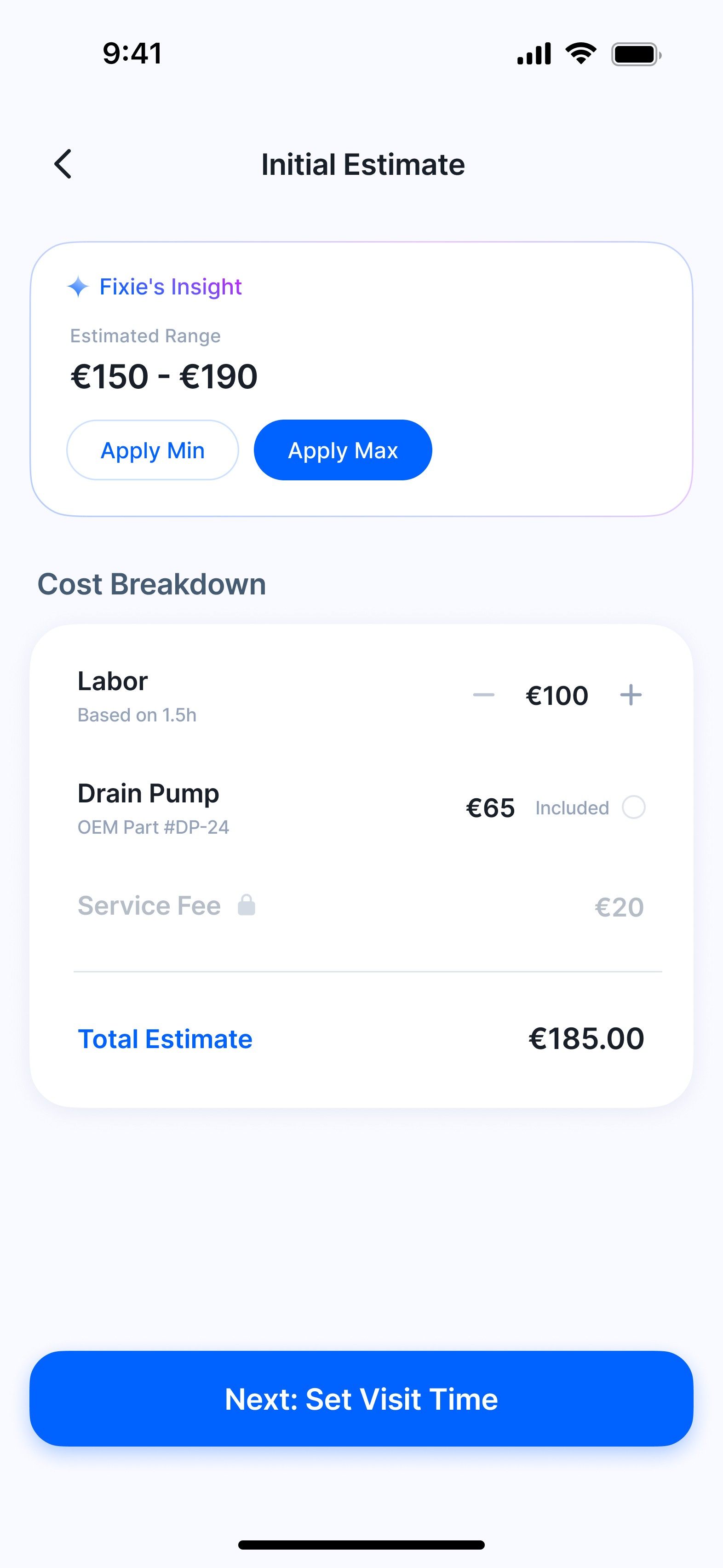
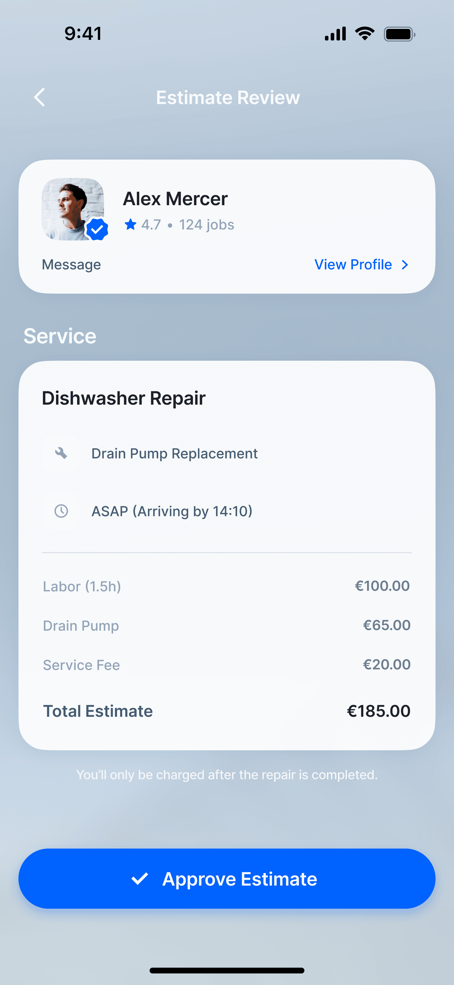
Interviews surfaced a simple fact: a technician can give a rough estimate the moment they spot the issue. That was the opening, align on cost early, before the work, not after.
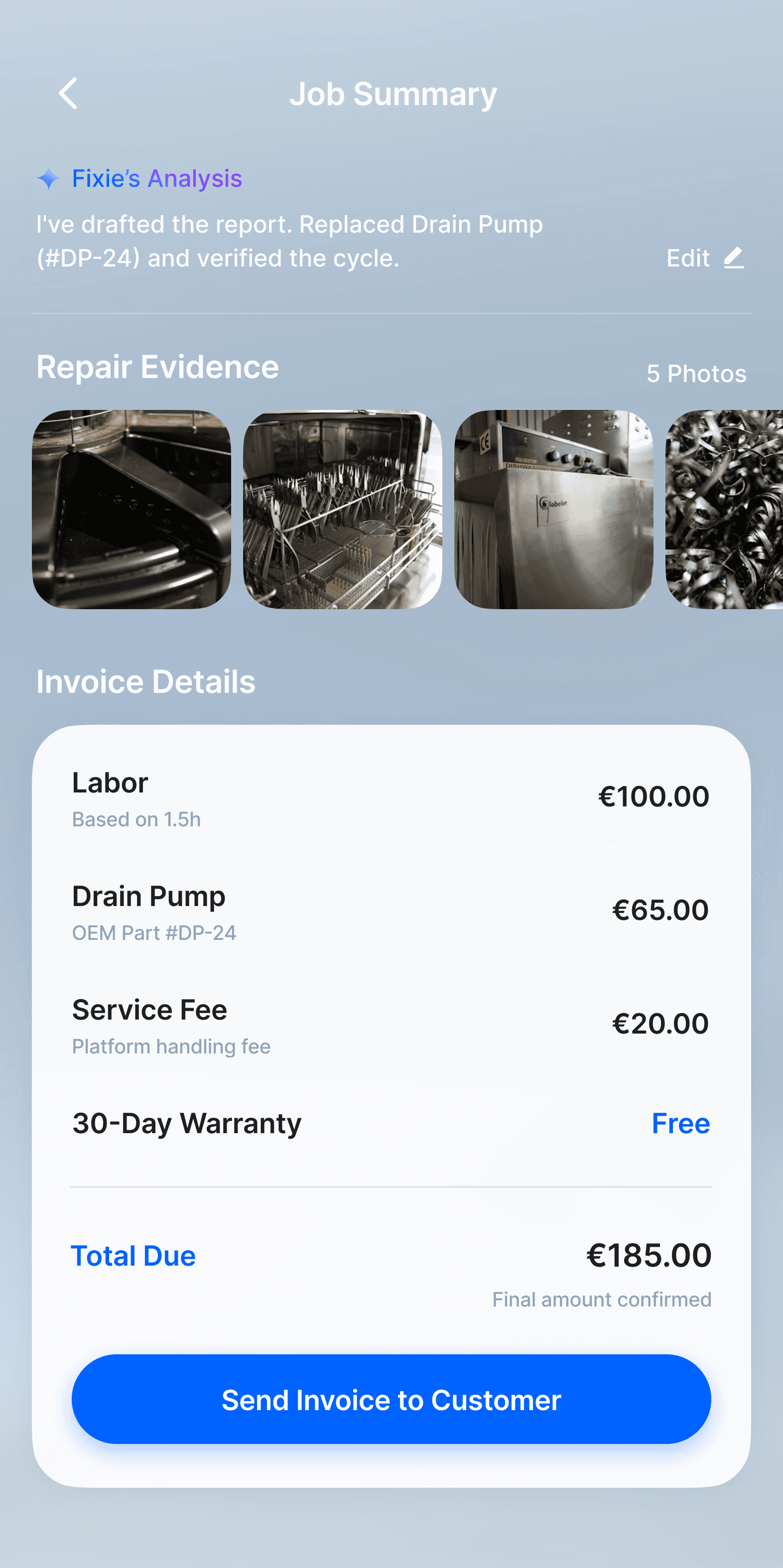
Once the repair is complete, the technician finalizes the work and submits:
AI-summarized repair report
Final invoice
Early alignment up front, clean confirmation at the end, so the last thing the customer feels is closure, not a surprise.
Supporting Interactions
Role-based entry
Users and technicians land in different flows from the first screen.
One place for every repair
Active jobs and full history, side by side.
See full breakdown
Pay with the full picture
Final cost, the work done, and proof, all before payment.
06. Impact
Before and After.
In Numbers.
This project is still at MVP stage with no live metrics yet.
Manual booking is measured from 14 past customer requests. Matched flow time comes from a prototype test with 7 technicians, directional given the sample size.
Time to first estimate
Manual booking
11–14 days
14 customers, past requests
Matched flow
under 30 min
7 technicians, directional test
Same task, different processes: getting to a first estimate. Manual booking took 11–14 days for customers. In a small technician test, the matched flow got that down to under 30 minutes.
Diagnostic loop

Structured AI intake replaces the phone-and-email ping-pong. The diagnostic loop shrinks from 5–7 days of back-and-forth to near real-time.
Where AI saved me the most time

This one isn’t about the user, it’s about my own process. Using AI for the slow early stages cut mock-up production from 3–4 weeks to about 1.5, freeing the time for the structural calls that needed me.
Small sample, early stage, but every source pointed the same way
: less waiting, less guessing, less friction.
"
Beyond individual repairs
Fixie closed three separate delays: matching, pre-arrival information, and visibility during the repair itself. Most of it ran in both directions, requesters and technicians waiting on the same gap from opposite sides.
What Mattered Most
Field constraints shaped this more than any visual preference. The UI followed thumb-zone reach, one-handed use, and real movement, reflecting how technicians actually work rather than how they were supposed to.
AI accelerated the process, but judgment determined its direction. The real skill was knowing when to override, when to reframe, and when the output simply wasn’t good enough.
"NEXT ARCHIVE"
ADVAISOR

DWELL
