
GYUHO Lee © 2026
Germany's application process, in one place.

Diruni
Timeline
Aug – Nov 2025
TEAM
Individual
MY ROLE
UX Research
Interaction Design
Prototyping
Usability Testing
Visual Design
Concept
For international students applying to German universities, official sources often leave key details missing, unclear, or scattered. This is where the process stalls before it even starts.
82% said important information was often missing.
That frustration was the brief. Diruni structures German university details into a single, scannable view, cutting the time between research and decision.


01. Highlights
One Structure for the
Whole Application Journey
Diruni brings university search, requirement checks, and application management into one consistent structure. Every screen is built around a single question: what does the user need to do next? The four sections below show the decisions that shaped it.
Faster access
Users no longer need to navigate across scattered websites and tabs. Key university information is now reachable in just a few focused steps.
Smarter preparation
Diruni gives preparation a single starting point: saved schools, requirements, and deadlines in one view.
Better
visibility
Because admissions competitiveness is rarely explained clearly, many students hesitate during planning.
Diruni visualizes admissions patterns to support more confident decisions.
And more.
Students often manage applications across scattered notes, tabs, and bookmarks.
Diruni brings search, recommendations, application tracking, and updates into one unified dashboard.
02. Design Challenge
Taking on the Problem

This shouldn’t be this hard.
But it is.

Before designing anything, I needed to understand why the process felt so broken. Not just which features were missing, but what was actually making students stuck.
⌛
Too much time wasted in the preparation phase
😵💫
Inefficiency caused by scattered information
💲
Low UX quality leading to extra costs
Designing an Intuitive, Efficient
Experience
Diruni turns Germany's scattered application process into a single decision flow, built first for Non-EU applicants.
The premise
Primary Audience 🎓
Non-EU applicants
Secondary Audience
EU students (including exchange and local applicants)
Design Objective
Streamline the German application landscape into a clear, user-friendly interaction model.
Data Principle
Maintain accurate, up-to-date entry requirements with Non-EU criteria set as the default standard.
What users get
Strategy, Sorted
Helps study-abroad applicants quickly set up their initial strategy
Info at a Glance
Essential information can be grasped at a glance
Design rule
Keep entry requirements accurate and current, Non-EU as the default.
03. Discovery
Mapping the Chaos: Uncovering the Student Journey
Before designing solutions, I combined my own application experience with desk research and the survey to see where students lost time, clarity, and confidence.
Three recurring patterns stood out.
Research Timeline
86% spent 1-3 weeks comparing requirements before applying.
Survey, n=28
Fragmented Resources
Information was spread across university sites, DAAD, PDFs, and forums.
Desk research

Firsthand
I experienced the same repeated verification process myself.
My own application
04. Insights
Hidden Challenges Shaping
the Journey
Through surveys and firsthand application experiences, I identified recurring UX gaps that shaped the project’s core design direction.
UX Breakdown
What I observed
Key insights
Three core drivers of inefficiency
Core Questions
Even though the service is well-designed, I was curious why it still doesn’t fully enable efficient workflows. I started with two key questions:
Q1
Are DAAD services fully supporting students in their study-abroad journey?
Q2
Can existing platforms truly support confident decision-making?
Key Insights
Based on the two guiding questions, this survey validated key pain points and captured real user experiences. The results provided clear insights that directly informed the design direction.
Survey of 28 international applicants to German universities.


71%
Dissatisfied with the DAAD portal
82%
Often felt important information was missing
46%
Named interpreting guidelines and organizing documents as the hardest step
68%
Postponed an application decision because of information gaps
05. Diruni’s Strategy
A Streamlined Journey
Diruni's UX strategy focused on reducing these root problems first.
By this point the diagnosis was clear, so this section shows how I ranked those structural problems and set the UX priorities before designing.
What follows
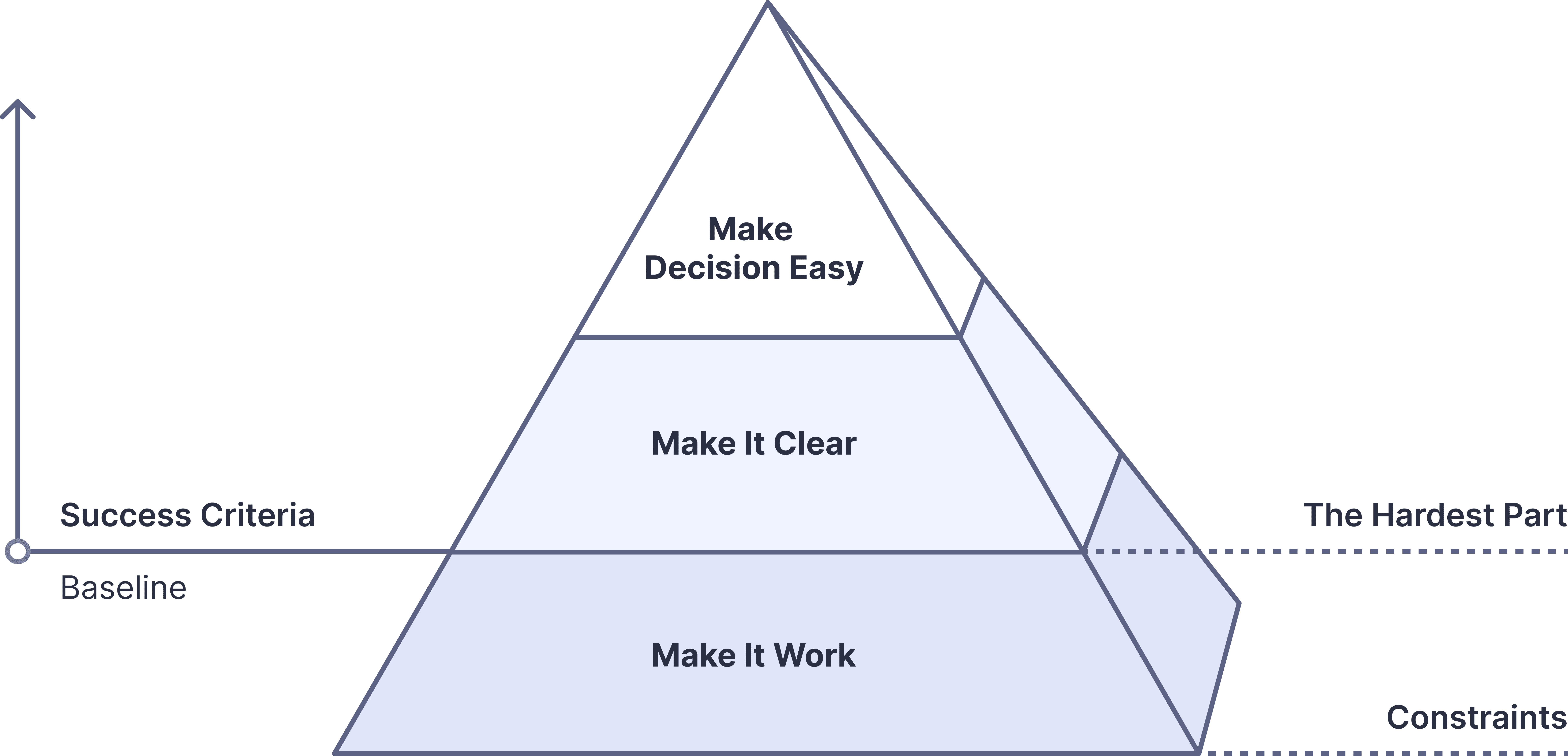
UX Priority Model
Key Problem Definition
Hypothesis
UX Priority Model
Before designing solutions, I identified which problems created the most friction instead of trying to solve everything at once.
Constraints — What limits the experience?
Each university follows different rules
Non-EU students must meet additional requirements.
DAAD information is scattered across multiple formats and languages.
➔ Data consistency became the top priority before improving the experience itself.
Success Criteria — What defines success?
Students can find essential information quickly
Tasks can be completed with minimal verification
Navigation feels intuitive across all flows
➔ Ultimately, the goal was to enable faster, more confident decisions.
The Hardest Part
The main issue wasn’t information overload, but fragmented workflows and repeated checking.
UX Priority Model
Principles
Behind the Model
Clarity Over Complexity
Even with large amounts of information, the structure remained simple, clear, and easy to navigate.
Focused Curation
Unnecessary details were reduced so users could focus on information that directly affected decisions.
Iterative Problem-Solving
The system was refined through repeated testing and feedback during the design process.
Efficiency & Flow
The experience was designed to reduce cognitive load and shorten the path to actionable information.
Key Problem Definition
These patterns became the foundation for restructuring the application flow throughout the product :
Unclear Paths, Repeated Checking
Problem
Application information is spread across fragmented paths, making it difficult to gather and understand requirements consistently.
Impact
Repeated verification: Students repeatedly search, compare, and cross-check requirements before feeling confident enough to proceed.
UX Strategy
Structure information into clearer, more consistent flows to reduce unnecessary confusion and repeated checking.
Different Answers, Different Outcomes
Problem
Admission requirements aren't consistently documented. Students turn to direct inquiry, only to face slow responses, conflicting answers, or none at all.
Impact
Stress and delays: When the official answer varies by person and day, students can't trust what they know or plan what's next.
UX Strategy
Cover the common cases upfront with standardized guidance, so most questions never need to be asked. For the rest, surface the right contact directly, no searching required.
Hypothesis
How can international students plan their application strategy
faster and more accurately?
Diruni approached this question with two core hypotheses :
Hypothesis 1
➔ Integrated information accelerates strategy planning
Users previously had to manually combine scattered information.
Key Structures : Search tab, summary cards, procedural tables, school-specific checklists
Goal : Reduce Time Cost
Hypothesis 2
➔ Personalized management reduces errors, omissions, and rework
Each user’s schools and requirements differ, requiring a personalized view.
Key Structures : Application Manage, Saved, checklist templates
Goal : Reduce Cognitive Load & Verification Cost
Design Priorities
Simple & Immediate
I made minimizing the Time-to-first-answer and reducing unnecessary friction the core principle of Diruni’s design.
To achieve this, I focused the design on reducing three key burdens users face in practice. Time, Cognitive, and Verification Costs.
UX Efficiency Kit
🕑 Time Cost — Save Time
💭 Cognitive Load — Understand Instantly
✅ Verification Cost — Eliminate Errors
Design Approach
Feature Sprint
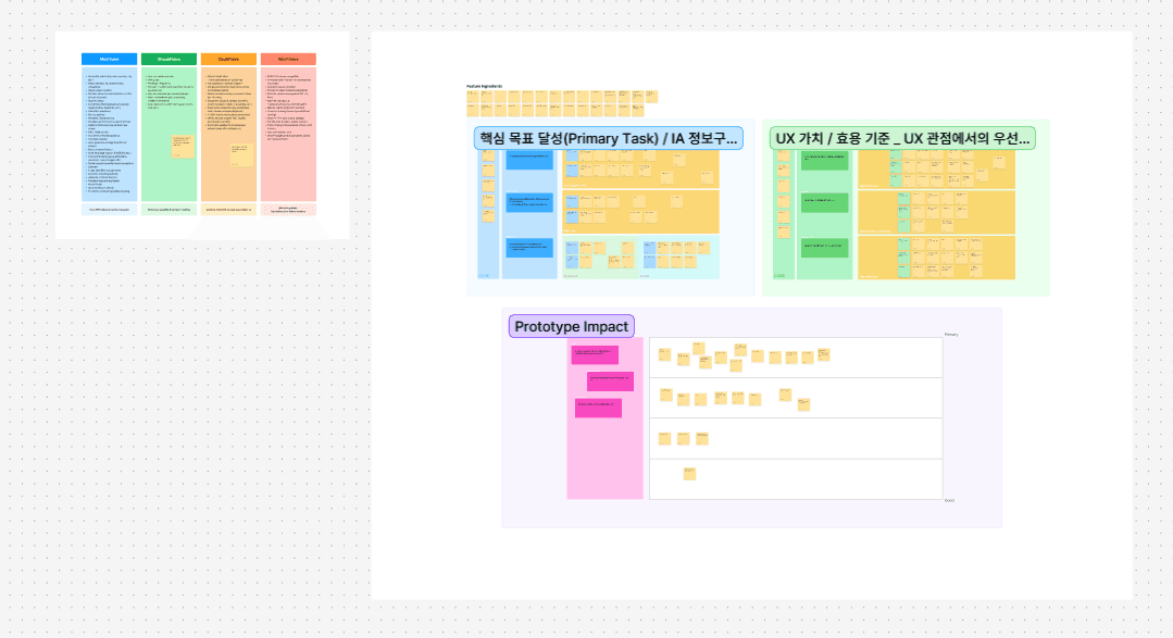
Core Feature Structuring
Prioritized core features through a card-sorting session with four international applicants.
Defined Diruni's core journey: compare → decide → plan.
View PDF

IA & Flow Design
Built the information architecture around how students search, compare, and prepare.
Simplified the main flow into: search → review → plan → manage.
View PDF
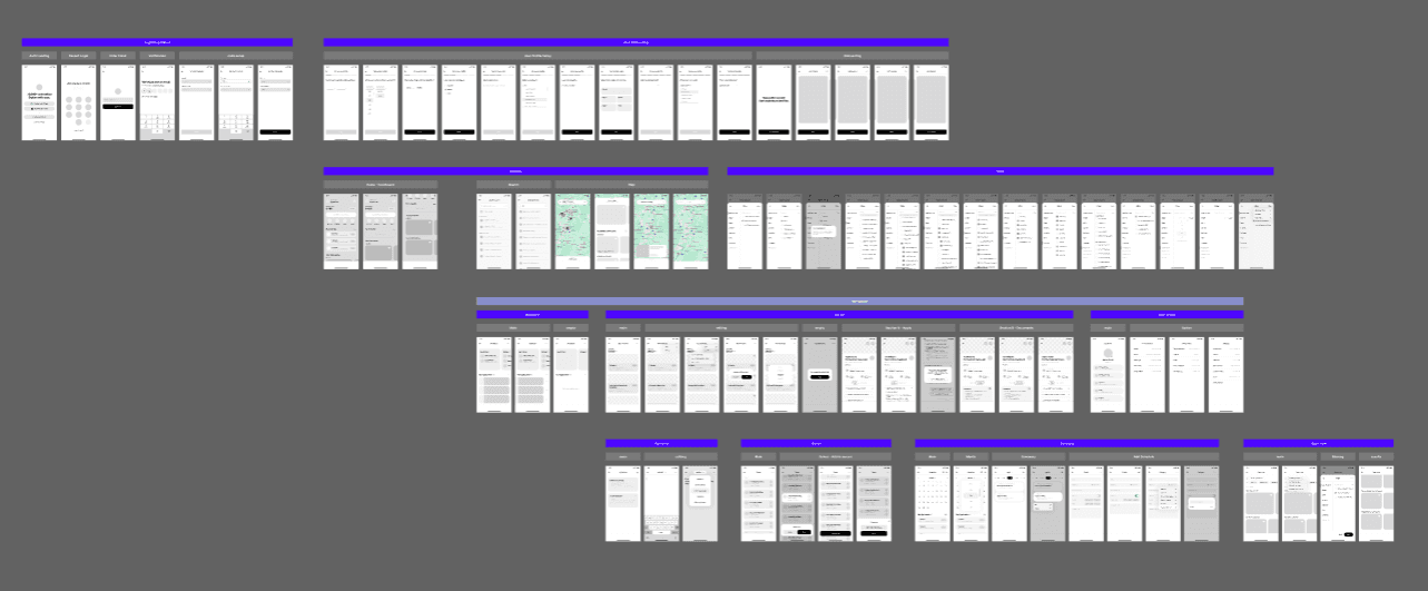
Wireframe Structuring
Built the first end-to-end skeleton in wireframes to lock structure and flow before high-fidelity design.
View PDF
Carried the structure into prototype testing, where it was refined with users.
06. Exploration
Minimal Clicks,
Maximum Clarity
Interface
at a Glance
Diruni was built around three things that kept slowing people down: too much time spent searching, too much to hold in your head, and too many steps just to confirm one fact.
The structure adapts to where each user actually is in the process, so nothing feels out of place or premature.
Time Cost
Problem
This is what “Unclear Paths, Repeated Checking” looked like in practice.
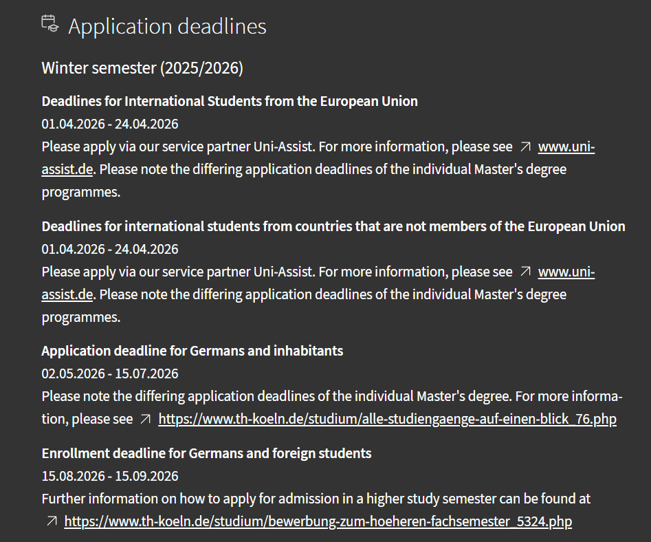
I kept running the same searches twice. DAAD’s “International” and “All Degrees” split appeared meaningful at first, but often resulted in duplicate searches and unnecessary re-checking.
Even simple decisions meant checking the same information over and over again.
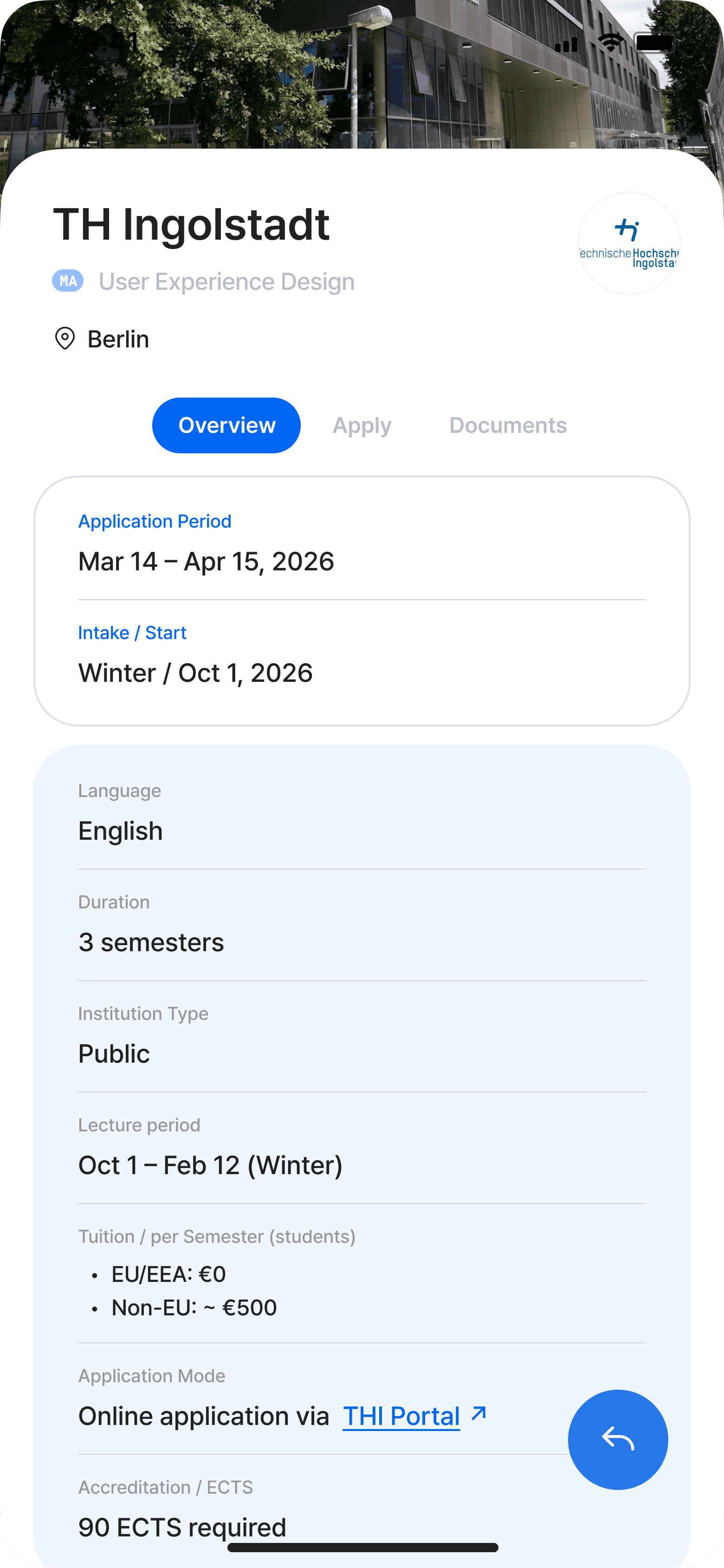
Direct Access to Core Information
Search was placed at the center of the experience to reduce unnecessary navigation during early planning.
In testing, users reached key university information faster and felt more confident moving forward without repeated searching.
Saving Progress, Faster Revisit
Users often restarted their research because there was no lightweight way to save schools during exploration.
To reduce repeated searching,
Introduced quick-save interactions
Built a centralized “Saved” space for tracking shortlisted schools
Filter Redesign: Fewer Options, Clearer Intent
Users didn’t need more filters. They needed meaningful ones.
The original system overwhelmed users with filter options that added complexity without improving decision-making.
The original filter felt overly complex:
Over 10 options
Many filters didn’t really help
Hard-to-understand terminology
Example: Overly Complex Term System
Although the system was only indicating enrollment periods, it used mixed labels such as Quarter, Trimester, and Semester.
The issue was not the information itself, but the amount of interpretation users had to do before making a decision.
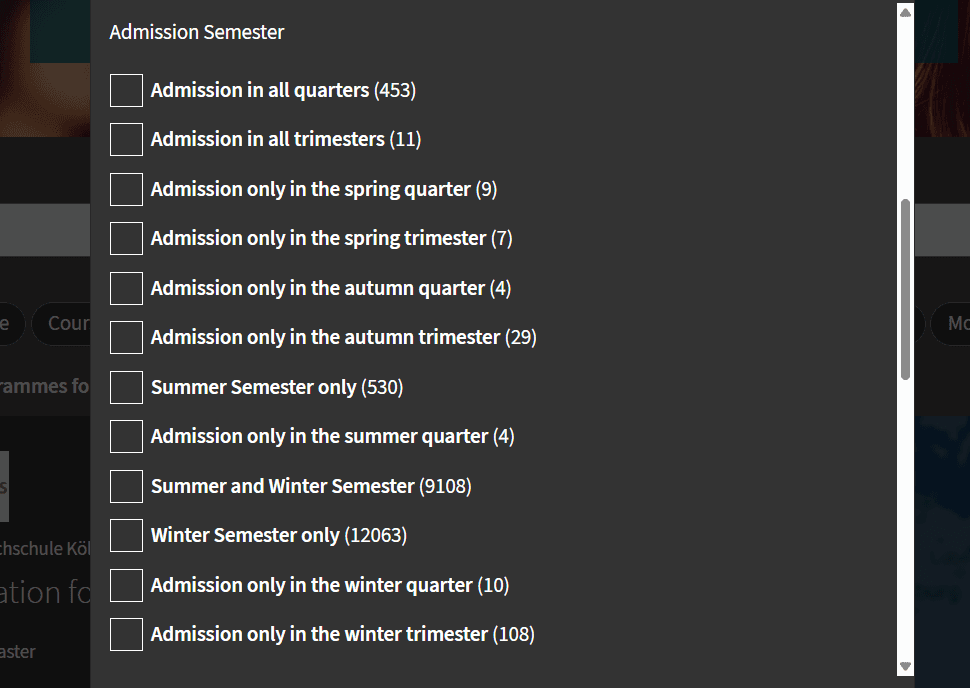
As a result, what should have been a straightforward choice became confusing.
Users had to decode terminology before making decisions
Seasonal options expanded into unnecessarily segmented choices
Confusing combinations made the filtering logic harder to trust
What users actually wanted to know was simple:
“I just want to apply for a specific term." 🙋♂️

Simplified Filter
Improvements
Removed unnecessary terminology
Prioritized high-impact criteria first
Simplified the path from exploration to decision-making
Result
The redesigned filter focused on fewer options, clearer criteria, and a shorter path to decisions.
Once the filters made sense, people stopped going back and started moving forward.
Cognitive Load
Intuitive Information Structure
When exploring universities through DAAD, important information was often separated across inconsistent structures, making it difficult to identify what actually mattered.
As users struggled to interpret and compare information across different sources, they repeatedly slowed down to verify what they had already seen.

Common issues :
EU / Non-EU pages often overlapped, with links that led nowhere.
Missing key details or overly long explanations
Ambiguous labels that required extra interpretation
Deadlines buried in inaccurate links
What User Testing Revealed
Users stalled. Not because the information was wrong, but because too much landed at once. (Left)
Splitting it into stages changed that. Users knew exactly where they were, and kept moving. (Right)

Final Design (Refined)
Overview-first structure for faster scanning
Clear separation between actions, dates, and documents
Consistent patterns across every school page
Structured Flow
Stage 1 → 2 → 3
Overview → Process → Documents
A standardized structure reduced the need to reinterpret information across different schools.
Quick look

Step by step
The paperwork
By revealing only the information needed at each step, the process became easier to follow and mentally lighter.
Key Info Card : 5-Sec Scan
Before (DAAD)

After (Diruni)
The redesigned card focused only on the information users needed to decide whether to explore further.
In testing, users understood the card within seconds without missing key details.
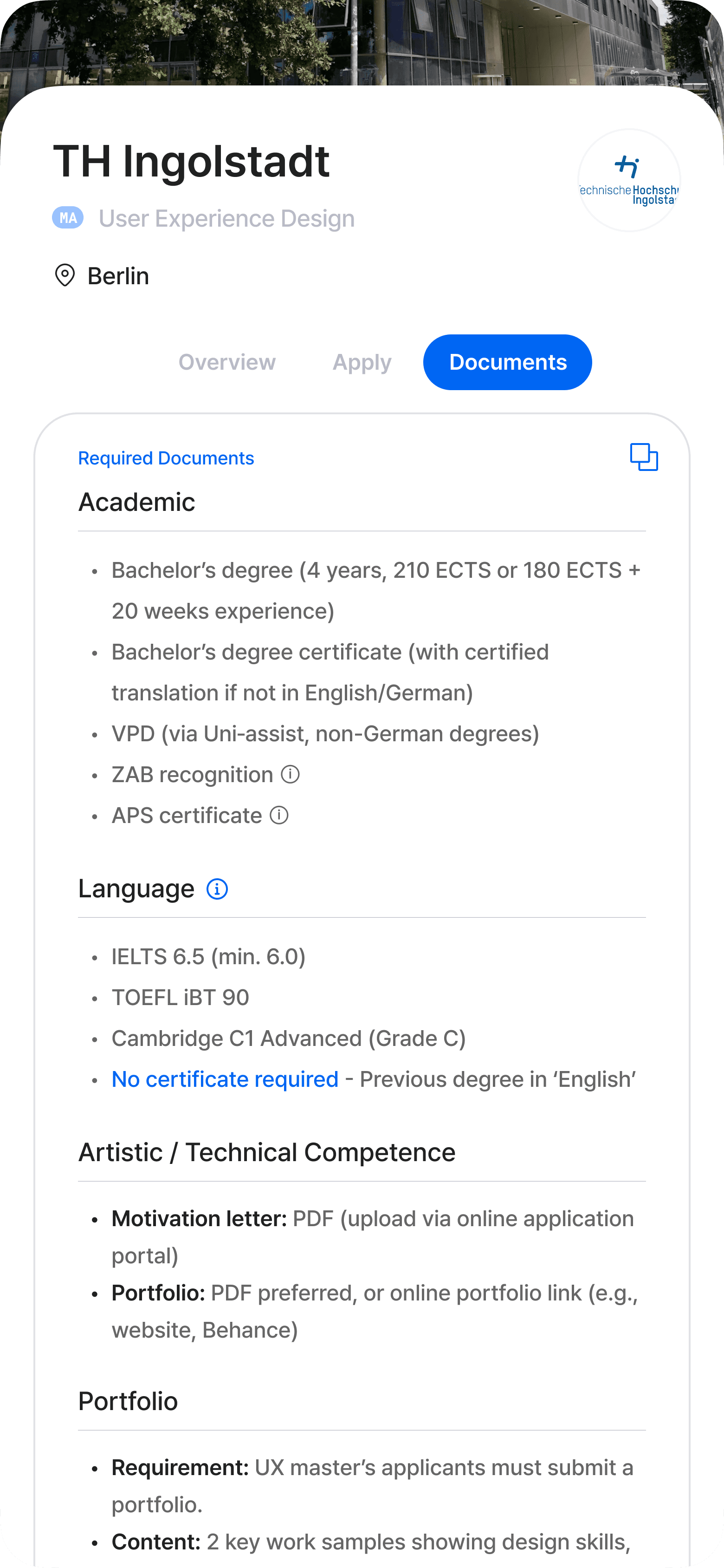
Verification Cost
Reducing Confusion, Building Trust
Even after finding the right page, applicants didn't stop at the official source. 79% turned to current students or acquaintances, 57% to AI tools, 50% to forums.
"What other sources did you use besides the official website?" Multiple select, n=28
User testing revealed two clear needs:
Verify information at the source
Act on it immediately
Checklist: One-tap action to move forward
Visit Website: Access the official source in one tap
Error-Free Verification
Following every step on the official checklist still wasn't enough. Students were asked for documents never mentioned upfront. 61% had to recheck or resubmit, sometimes missing deadlines entirely.
Designed structured checklists that track school-specific requirements in real time, helping users prepare documents quickly with fewer missing steps.

Clear steps. Never miss.

No stale info here.
Supporting Features
After defining the core UX, I introduced a set of lightweight features designed to make the application journey faster, clearer, and easier to navigate.
Competition Insights: When Official Data Is Missing
Not all universities publish admissions data, especially art schools where official indicators are often unavailable.

NC data available

Art students, no need to worry
To reduce uncertainty, I designed an alternative benchmark using applicant experiences and community-based feedback patterns.
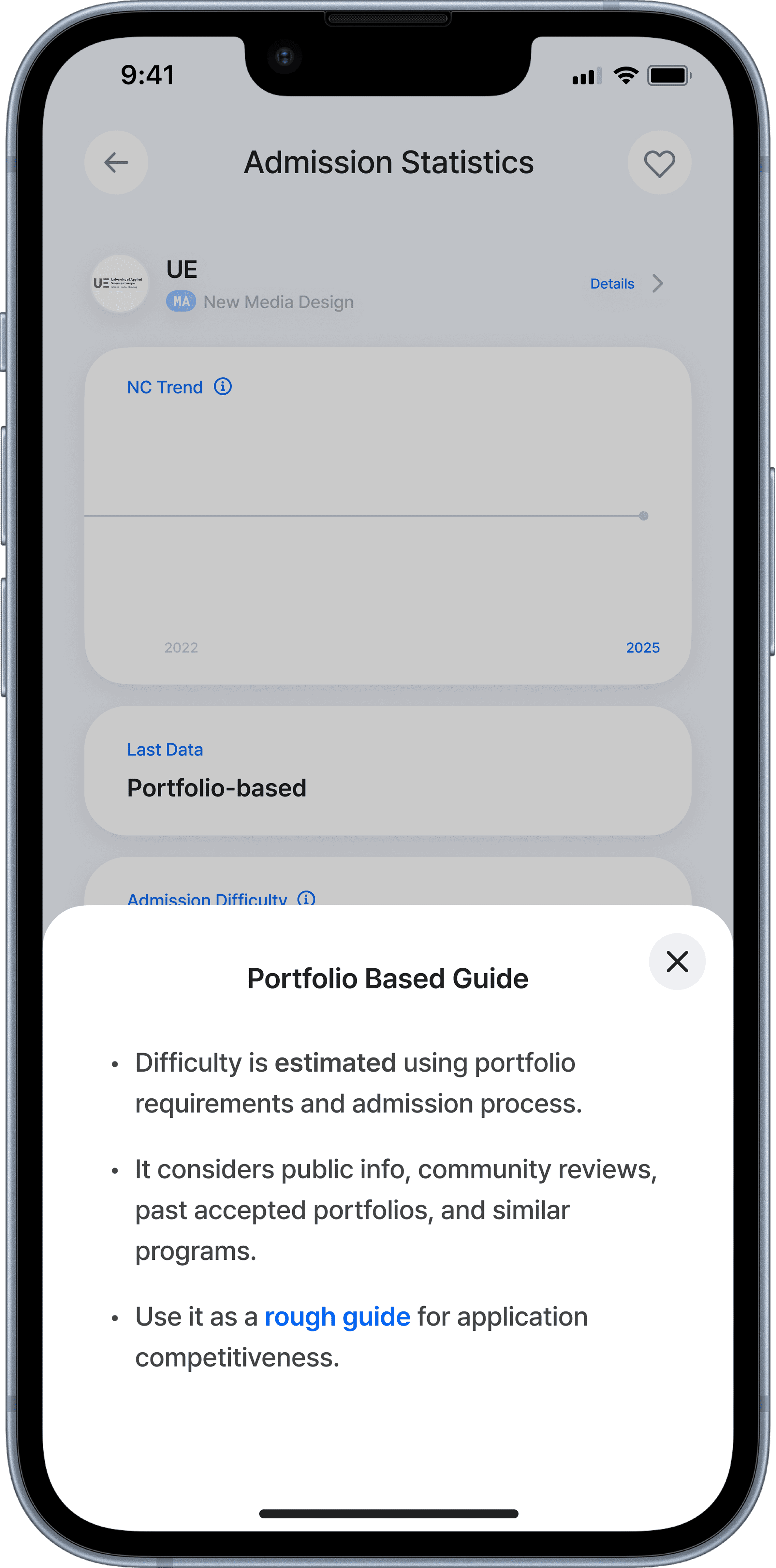
“I want to quickly understand how competitive this school is.”
Open Now: Schools You Can Apply to Right Now
Some users did not start with specific target schools:
“Show me what I can apply to today.”
Instead of forcing broad exploration, this feature prioritized schools that users could apply to immediately.
Prioritized currently available programs
Defaulted to Non-EU criteria with a simple EU toggle
Designed as an action-first view, not a browsing list
07. Design Outcome
What changed,
in numbers
These outcomes come from a four-person prototype test, the same participants from the earlier card-sorting session. They're directional signals from lightweight, comparative task observation, not production-scale KPIs.

Testing day. Four friends preparing for university, powered by kebabs.
Task: THI's early admission steps.
Clearer Decisions, Less Rework

Repeated verification dropped from 12 → 3 checks per school (a check = reopening a previously visited page to re-confirm a requirement), helping participants move to the next step with confidence.
“I didn’t feel the need to go back and confirm things again.”

Benn
22, Republic of Congo
Faster Time to Clarity

Time to understand a school's key requirements and preparation steps dropped from 55 → 15 minutes across the prototype iterations, and the selection process became noticeably more linear.
Lower Cognitive Load

Parallel tabs during requirement checks fell from 8 → 3. Fewer open tabs meant less re-orienting and re-verifying, the two patterns that slowed participants down most in the baseline flow.
What Actually Changed

The journey shifted from 'navigation-heavy' to 'action-driven'.
Participants stopped backtracking; the flow turned into forward motion. Observed consistently across all four participants.
Back to the Hypotheses
Did the two bets from section 05 hold?
H1
Supported · directional
Integrated information accelerates strategy planning
Search, summary cards, and procedural tables in one place.
55 → 15
min to understand a school's requirements · Time Cost
H2
Supported · directional
Personalized management reduces errors, omissions, and rework
Application Manage, Saved, and checklist.
12 → 3
checks · Verification Cost
8 → 3
parallel tabs · Cognitive Load
Why This Result Matters
The problem was never the amount of information. It was knowing what to do next.
By reshaping the journey into an action-first flow, Diruni helped users move forward without second-guessing or getting stuck.
“It feels like something is guiding me forward,
instead of making me fight through information.”

Gabriel
21, Spain
Reflection
Honestly.
This started as a personal frustration and became a real design process. The messiest part wasn't the wireframes. It was figuring out which problem was actually worth solving.
Good UX isn't about reducing information.
It's about reducing uncertainty.
Also the Applicant

Before I designed anything for Diruni, I lived it. I went through the German application process myself, the same one this project is about. That gave me the problem on day one. It also meant I had to keep asking myself whose frustration I was actually solving, mine or the other 27 people in the survey.
A Studio Filled With Ideas..🧠


My desk never really stayed clean during this project. Sketches piled up on post-its, and flows were crossed out and redrawn again and again. But watching that mess turn into something that actually worked was the point.
"NEXT ARCHIVE"
DWELL

nooding