GYUHO Lee © 2026
One second, before you can't undo it

DWELL
Timeline
Jul – Sep 2026
TEAM
Individual
MY ROLE
Concept & Direction
Interaction Design
System & Test Strategy
AI Pairing
Before an AI sends, buys, or commits for you, one second of resistance. I built it twice. One you feel on a screen, one that runs as real, tested firmware.
THE TENSION
“We stopped deciding.”
AI made every choice easy to skip, so we skip it. It drafts the email, fills the form, picks the plan, and we wave it through. Apps keep making it easier to say yes, so we check less, even when it matters most. By now it touches almost everything: what we buy, when we sleep, who we trust.


"What if resistance was the point?"
Most design spends its energy removing friction. Fewer steps, fewer clicks, nothing left between you and done. DWELL goes the other way, on purpose.
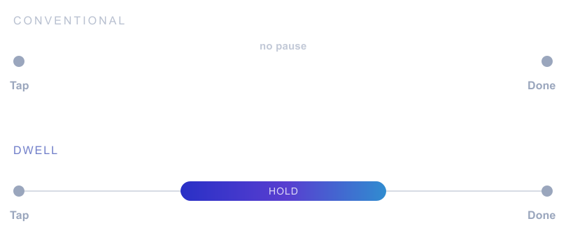
Same tap, same finish, only the middle changes
It adds a short pause only at the step that matters. It doesn’t block you. It gives you a few seconds to check before you confirm.
I chose its cool blue on purpose, so the moment reads as calm rather than alarm. The pause is a cognitive forcing function. Such pauses curb overreliance on AI, but the most effective ones are the least liked (Buçinca et al., 2021).
So the pause has to be easy to accept and still work.
scene ꞏ THE APPROVAL GATE
One click. 340 people.
Picture the moment. An AI agent is ready to email 340 people for you. Twelve of them sit outside the company, three are executives, and none of it can be pulled back. One click sends it, whether you click or the AI does.
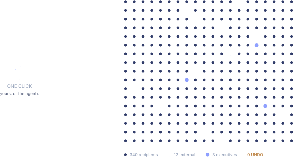
DWELL appears in the moment before action, while the choice is still yours.
the contrast
Three ways to meet
the moment.
Same decision, three responses. I built all three so the difference is something you feel, not something you take on my word.
It runs right here. Click in
No friction tap
One tap, already gone. The default we all know.
Screen friction
A dialog asks if you’re sure, and most people click straight past it. A safeguard that rarely does its job.
Tangible friction
You keep holding while it shows who the email reaches.
Resistance you can sense is resistance you can’t autopilot through.

form ꞏ WHY A RING?
Shaped like a ripple.
The ring’s job is to make one thing clear before you send: the message goes to everyone, and it can’t be undone.
Same send, two forms
I built it as a sphere first. It looked good, but on send it just burst in place, and nothing showed the message going out. The ring fills as you hold, so you can see how close you are; let go early and nothing is sent. Once it’s full, it sends and spreads across the screen.
That spread is the point:
you watch the message reach 340 people instead of just reading the number.
THE HELD MOMENT
Hold, and it's yours again.
The hold reads you.
The faster you’ve been confirming, the longer the next hold; slow down and it gets shorter.
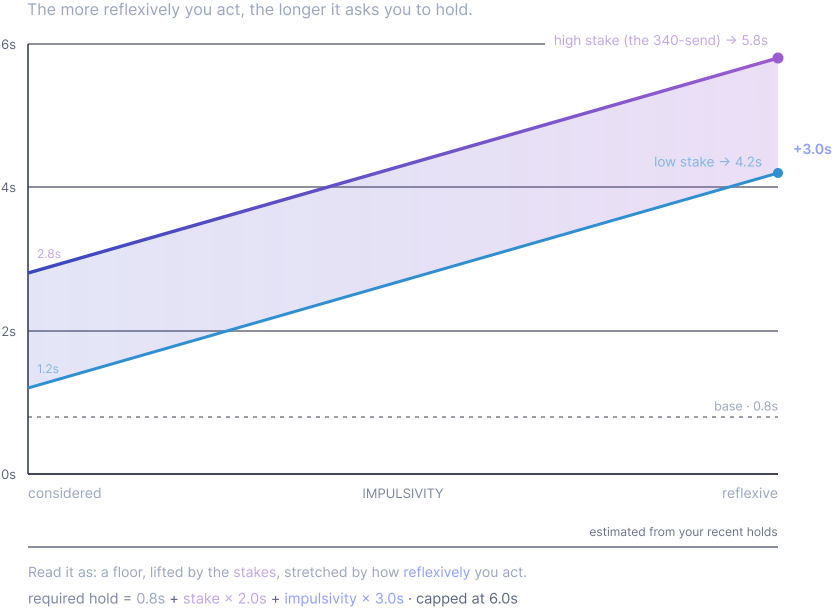
The wait adapts to each person instead of using a fixed timer. Whether that helps is the question this project tests.
trust
The same idea, in two bodies.
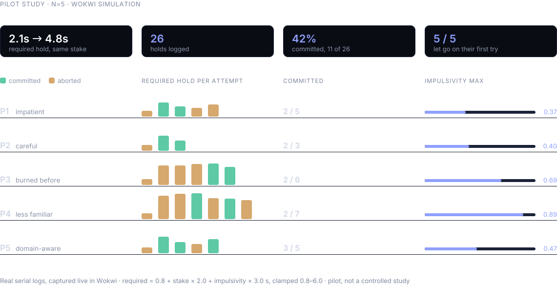
On screen you can feel it; in code you can check it. The decision logic is separate from any screen or chip. It runs on a laptop and on a virtual Arduino board and passes twenty unit tests you can run yourself, so the adaptive wait isn’t just an animation.
Simulated in Wokwi. Each hold logs one row
Then five people tried it with the same task and stake. The wait ranged from 2 to nearly 5 seconds, set only by how each person behaved.
WHAT THEY SAID
P3 · THE PAUSE CAUGHT A REAL MISTAKE
“While I waited, I re-checked the recipients and the text, and found something I actually had to fix.”
the imposed dwell surfaced an error the user would have sent
P5 · AN HONEST LIMIT (IT DROVE A DESIGN CHANGE)
“I couldn’t feel the exact commit point. It just felt like ‘held long enough.’ A state/timing cue would help.”
→ the case for the filling-ring progress feedback
One honest note on scope:
this is an engineering and design demonstration, made in pairing with an AI coding assistant.
I owned the system design, the decision logic, and what the tests had to prove.
reach ꞏ BEYOND ONE INBOX
The email is just the stage.

The inbox is only the example. The real subject is any moment where one reflexive tap is irreversible and reaches further than it feels: wiring a payment, deleting an account, approving a bulk action, confirming a clinical order, signing something legal. Wherever an agent acts for you, a held second is cheap insurance.
I kept DWELL a generic commit control, not an email widget, so the same friction transfers without a redesign.

THE MAKING
Made, not found.
The fluid isn’t decoration; it’s how you see the pause. Each material had to do two things: fill as you hold, and spread when it sends. I chose by that, not by taste. Flat 2D water didn’t look serious enough for a decision that matters. Chrome and frosted silicone were opaque, so you couldn’t see them fill or spread.
2D → chrome → silicone → blob → ring
The result: clear water around a coloured core, so you can see it fill as you hold.
the honest limit
This is a design probe, not a finished claim.
limit #1: A probe, not a trial.
Five people, real logs. Enough to show the friction adapts to the person and can change a decision. Not enough to prove it holds at scale, or over time.
limit #2: A heuristic, not a measurement.
It reads recent hold history, not a person’s actual state. A working proxy, not a calibrated one.
limit #3: The open question.
Over time, people may get used to the hold and do it without thinking, like clicking past a dialog. Whether the pause keeps working is the next thing to test.
REFLECTION
What it is, and where it goes.
DWELL shows that friction can be designed, adapted to each person, and built both on screen and in firmware.
Turning it into a study is
straightforward to scope:
Run the three conditions and measure whether tangible friction lowers reflexive confirmations. Abort rate against required dwell, time to decide, self-reported certainty.

Next, it moves from the simulator to a real device.
The firmware is ready; it only needs the board.
Until then, the second is yours.
"NEXT ARCHIVE"
Fixie AI

DIRUNI