
GYUHO Lee © 2026
A daily AI brief that ends

ADVAISOR
Timeline
Jul – Sep 2026
TEAM
Individual
MY ROLE
UX Research
Usability Testing
Interaction Design
Design System
AI Pairing
From the day’s AI news, 47 updates in the demo, it hands you the 4 that change something for you, shows what it left out, and tells you when you’re done.


Morning, one card, done. That’s the whole product, on purpose.
3.33 → 1.50
Anxiety about falling behind, 1 to 5, six testers
4.67 / 5
Trust in the filter
3 of 3
Testers who doubted the brief read the revised one as complete
Getting there broke two of my own assumptions.
The three-card cap I built the whole brief around is gone. Six of six had backed it.
One weekly number took three tries before it stopped looking like a backlog.
01. THE PROBLEM
"I gave up trying to keep up."
B, camera repair technician, before the test
You hear it wherever AI news comes up: in Threads, Reddit and Instagram comments, in conversation, and from my own testers before the test.

Six from Threads, Reddit and Instagram comments and conversations.
Two from people who later tested it. Translated from Korean and shortened.
Different people, the same two problems: it never ends, and keeping up is left to you. Some call it AI FOMO.
And every AI product answers the same way: here is more. More summaries, more digests, more things you should have read. They’re judged on how long you stay, so none of them is built to finish.
6 of 6
get their AI news from a social feed. All six named Instagram
4 of 6
rated their sense of falling behind at 3 or more of 5, before using anything
0 of 4
common fixes ever reach a state called finished
“To keep up, I’d have to live inside that ecosystem all day. I’m not unemployed. It’s physically impossible.”
— E, engineer, on how they usually follow AI news
Newsletters
curate, but skip a day and they stack up.
Feeds
stay relevant and never end.
Read-it-later apps
save things and grow a backlog.
Summarizers
shorten things, and you still pick what to summarize.
None of them ever tells you that you can stop. What would a product look like if it did?
02. THE PRINCIPLE
Honest. Finite. Quiet.
My answer was a brief that ends: filter hard, hand over the few that matter, and say when you’re done.
But filtering is easy to claim and hard to trust. So before drawing a screen, I wrote down three tests, and every decision had to pass all three.
Honest
Does this shrink a true number to make someone feel better?
A filter that lies about volume can lie about relevance.
Finite
Does this create something that accumulates?
A list turns into a queue, and a queue turns into a backlog.
Quiet
Does this ask for a decision before there is one to make?
Every badge and unread count is a small demand.
03. THE TEST
Finite read
as hidden.
Then it went to six people, on their own phones, from one live link. Twenty to twenty-five minutes each, thinking aloud.
A · design student
B · camera repair technician
C · office worker
D · designer
E · engineer
F · student
Before the first session I wrote down what would count as support or failure, and that a problem needed two people before I’d treat it as real.

The two that broke were the two I had built on.
“I want to read more. Isn’t there a next step? Finishing after just three feels like a letdown.”
— E, engineer
“Limiting it to three makes it feel like the rest is being hidden from me.”
— F, student
Translated from Korean. n=6, September 2026.
Three people read a finite brief as concealment. No rewording would have fixed that. The product asked for trust and gave no way to check.
04. EXPLORATION
Filtering,
not feeding.
Nine decisions, grouped by the test each one answers. Most start with an idea I threw away, and 05 is where the concealment problem got its answer.
Honest
Does this shrink a true number to make someone feel better?
01
The Cap That Lied
All six testers said three cards a day was enough, so I recommended keeping the cap. Then, rereading my session notes, I found D describing a normal day: “Three main updates. Five at most.”
Three was the usual day and five was the busy one, so a cap would trim exactly the days that matter. It was never in the code. It was mine, and now the count comes from the filter.
Normal day · 4 cards
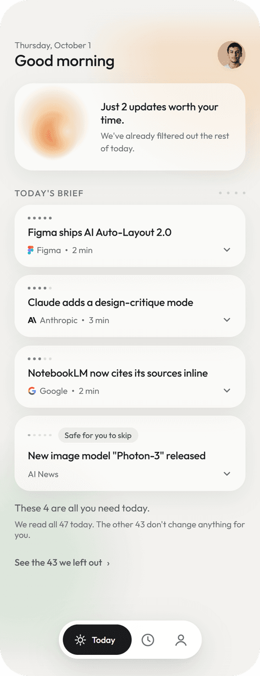
After four days away · 7 cards

Four on a normal day. Seven after four days away. The number is not a design decision.
02
The Number That Read as Debt
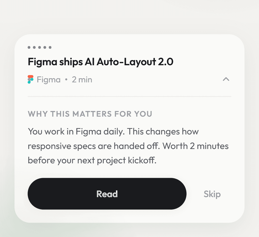
The closing screen led with 47, everything scanned that day, under a line saying you didn’t have to read them. It still read as forty-seven things waiting.
Cutting it to 14 looked calmer and lasted a day. A number shrunk to feel better fails Honest, and an open count reads as debt at any size.
So the big number became the 4 you finished, and the rest moved to the past tense: “We read the other 43 so you didn’t have to.”


Same day. Same facts. One of them feels like homework.
03
A Count That Never Grows
History shows what the filter kept away that week: 312. The label was right. The motion wasn’t: a big number fading in draws the eye, and it looks like a pile to catch up with.
Counting down from 936 showed a reduction, but the bigger number stayed readable for two seconds. I still think that second version is the better piece of motion. It said the wrong thing.
The third never counts. A scan line crosses a dot grid and leaves only the dots that form the number. Asked whether 312 felt like a burden, all six said it was fine.
Three tries. The last one never shows you a number you have to catch up with.
04
The Half of the Week I Filtered Out
The filter keyed on one thing: your field. E asked twice whether news about research and document tools had been cut. That was the reading and writing half of E’s week, missing from a brief that promised everything you need today.
Only one person raised it, and my rule said two. I acted anyway, because this was a flaw in my own taxonomy, and a flaw doesn’t need a second vote. Tools everyone uses now get in whatever your field.

It filtered by field and missed the tools E uses every week.
Finite
Does this create something that accumulates?
05
A Receipt, Not a Feed
Four of six asked to see what was filtered out. I had ruled that out, because handing back the pile defeats the purpose.
But trust went up when the app showed how much it had filtered, and at least four said they’d opened the card marked safe to skip before letting it go. What they wanted was a way to check my work.
So it’s a receipt: title, source, time, nothing to open. It gets no tab and never a number badge. 43 counts what we handled. A badge would turn it into what you’re behind on.

Title, source, time. Nothing to open.
06
Four Days Are Not a Backlog
Coming back after four days, a pop-up summed up what you’d missed. “It feels like a flash sale,” D said. “Like I have to look right now, and if I dismiss it everything disappears.”
D suggested a separate tab for it, and my own first plan was full screen. Either way, the days away would sit somewhere as a pile to catch up on.
The word that mattered was “disappears,” and it was literally true: those items were shown once, then never again. Now they join the brief, tagged “While away.” Four days off makes a longer morning.

The days away join the brief. They do not get a folder.
Quiet
Does this ask for a decision before there is one to make?
07
Nothing to Decide Yet
Some mornings open on a full-screen count: dots fill the screen, a number rolls, and it lands on how few made it through to you.
The first build showed everything at once. The buttons were live while the count still ran, so the screen meant to show the filtering became the one you skip.
Now it has an order, and you can still close it from the first frame.
0.3s the field. 2.0s the buttons. 2.3s the note.
08
Thin, But Never Faint
I wanted the interface a weight lighter, so I measured first: the caption grey was already at 2.43:1, and thinner type makes faint text worse. So weight and colour moved together, and the grey went up to 4.63:1.
That fix nearly broke something else. The low-importance dots shared the grey, so darkening it made low importance look heavier than high on every card. The dots now keep their own colour.


Thinner type needs darker ink. And the fix nearly inverted the ranking.
09
An Entrance That Asked for Work
The app used to open on its mark settling into place and fading. It was well made and told you nothing about the product.
My first idea was a gesture: press the mark, push up, and it snaps open. I built it and it worked, but it failed Quiet: one more small demand on every launch, from a product that promises to take work off you.
The version that shipped asks for nothing. The day’s updates, 47 in the demo, hang as faint specks. Most sink away, and the 4 that matter run together into the mark, which becomes the orb that greets you.
Where it started, what my own test rejected, and what shipped.
05. THE CRAFT
Seventeen
no one saw.
Behind the full-screen moments, seventeen controls were still reachable by keyboard. No test session would have found them.
A geometry audit did. Checking tap targets, tab order and contrast on every screen by hand isn’t realistic for one person, so I had the coding agent write it.
Then I planted a defect of my own to prove it could fail. A check that finds nothing and a check that does nothing look exactly the same.

The reference is the product: values read live, contrast computed, every state shown.
The design system at /?ds renders from the app’s own code. Colours are named by job with their measured contrast, and every component shows every state. That view caught one more miss: a button label at 3.2:1, now 5.6:1.

06. THE RESULT
What moved,
what didn't.
Scored on the same three tests. Six people, September 2026.
Honest
4.67 / 5
Trust in the filter (5, 5, 5, 4, 4, 5). Nobody asked for a smaller number
Finite
3 of 3
Not supported at first: 3 of 6 expected more. Asked again in writing on the revised version, all three said it felt complete, and two said the list raised their trust
Quiet
3.33 → 1.50
Anxiety about falling behind. Four dropped, two stayed, none rose

One line per tester, scored 1 to 5.
“When the AI FOMO hits and I’m rushing to keep up, I don’t know if you meant it, but the look and feel let me take the whole thing slowly.”
— C, office worker
THE HONEST LIMIT
Six people, one round.
Qualitative, so every number here is directional. Completion time was never measured.
My own sessions.
I ran all six, and every tester knew the app was mine.
A retest that knew.
The three I asked again knew the brief had been revised after their feedback.
No live news.
The filter runs on fixed demo content. What this shows is the interaction around a filter. The filter itself is untested.
07. REFLECTION
Built to
be closed.
I hid what the filter left out to save people time and attention. It did the opposite: the hidden part became what they wondered about. Making the filter checkable did more for trust than making it invisible.
Every decision I reversed had drifted the same way: toward showing more, holding on longer, or making a number look better. Restraint is something you keep losing.
What I gave the agent, and what I kept
I gave it the work where being wrong should be cheap: building, then rebuilding. That’s why I could throw away two counters that already looked fine.
The calls on this page stayed with me and my session notes. The agent would have kept the cap at three, because six of six said so. The line that overturned it came from rereading those notes.

WHAT’S NEXT
Would anyone read the receipt daily?
One of the three retested already called it fun to browse. Count the days a week it’s opened. If it’s daily, Finite was wrong.
Does the closing card’s exit get in the way of closing?
Count how often it’s used instead of simply closing.
Does anyone wonder what the importance dots mean?
Count the taps on them.
The first needs a backend. The other two need one analytics event each.
Best on a phone.
"NEXT ARCHIVE"
nooding
Fixie AI
